
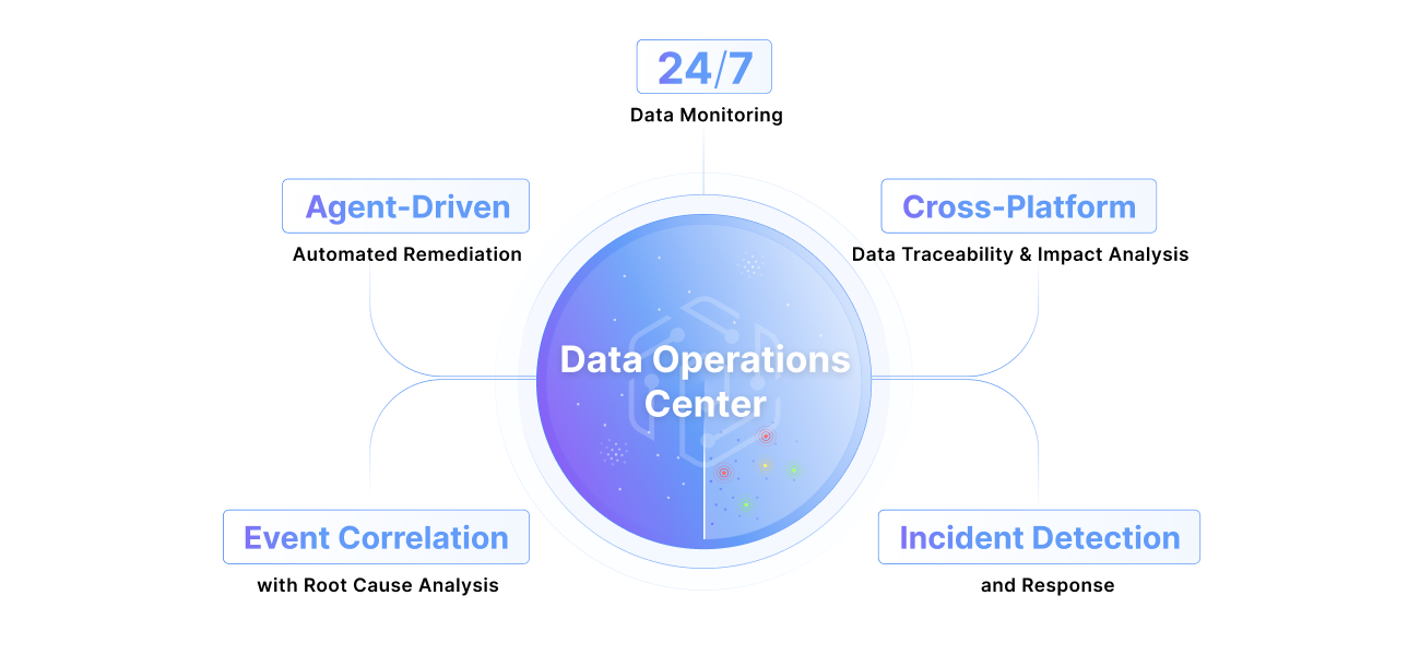
What is a data operations center?
Learn MoreWhat is a data operations center?
Learn More

At enterprise scale, data lineage stops being a UI feature and becomes a systems problem. We rebuilt Pantomath's Lineage Explorer from the ground up, new renderer, new data layer, new layout engine, to handle thousands of nodes without breaking a sweat.
Rebuilding Lineage for Enterprise Scale

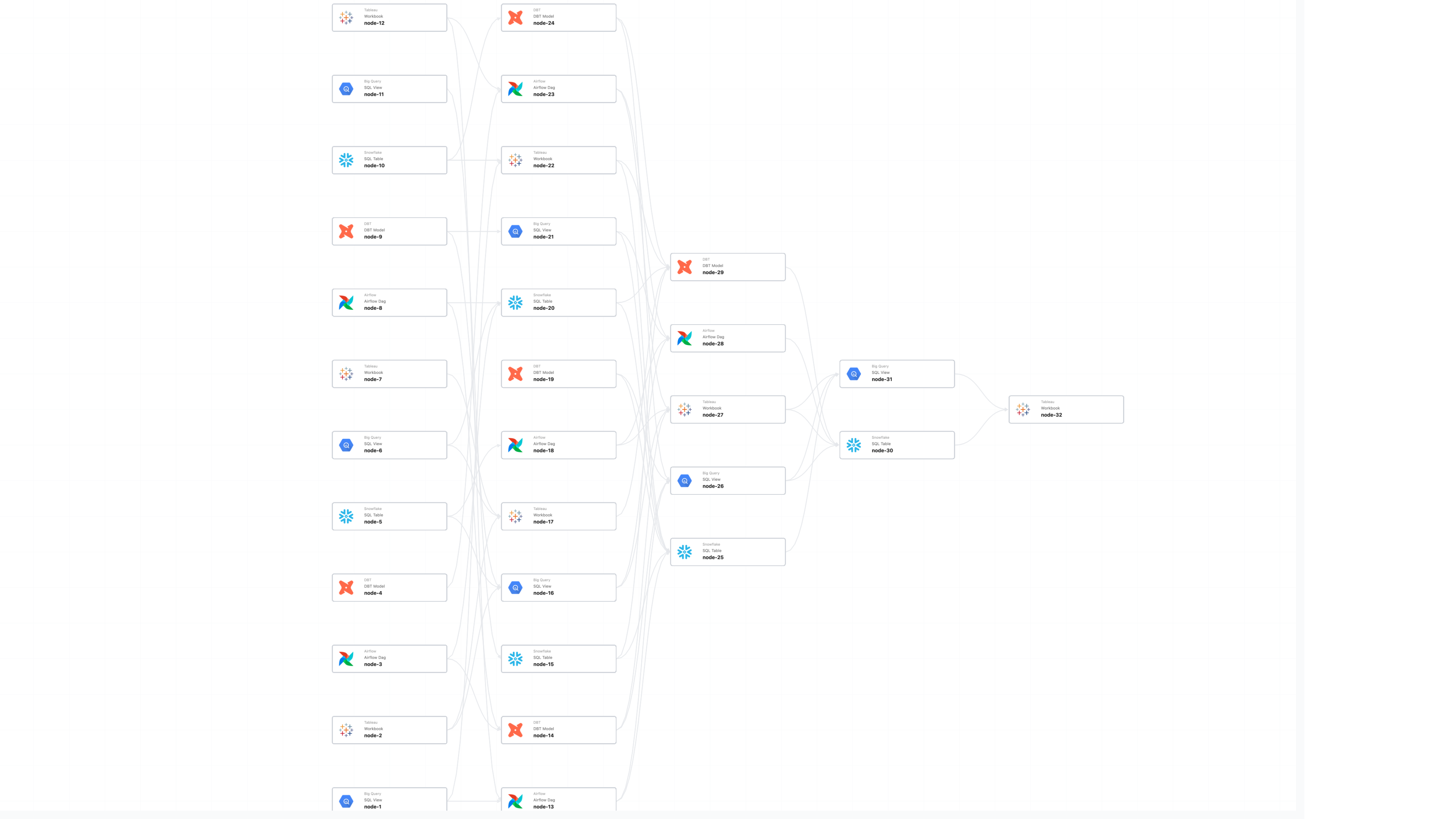
Lineage is how a data team answers the questions that matter when something breaks: what failed upstream, what’s about to break downstream, where to look first. At the enterprise level, this map is a massive graph with thousands of jobs and tens of thousands of datasets. A routine investigation often involves navigating more than five thousand nodes. At that density, lineage stops being a UI feature and becomes a high-performance systems problem.
Pantomath stitches lineage across ecosystems like Databricks, Snowflake, Azure Data Factory, and Tableau into a single view. Our original approach started from a finished output with a report, a dashboard, a warehouse and walked backward through everything that produced it. It worked at hundreds of nodes. At thousands, we could see the ceiling coming.
The shape of the product was part of the problem. Lineage was anchored to the pipeline (pick a pipeline, see its graph) which worked when an asset lived cleanly inside one. The teams we work with don’t have that luxury. The same Snowflake table feeds three Tableau dashboards, two Databricks jobs, and a mart owned by a different team. As data estates grew more interconnected, this design assumption no longer held — a single asset crossing pipeline boundaries meant no single view could show the full picture.
Many-to-one dependencies were the worst case. The joins where ten upstream sources collapse into a single critical output are exactly what a reliability engineer wants to see during an incident, and exactly what the old UI was structurally bad at showing because it thought in pipelines, not assets.
Scale made it worse, but scale wasn’t the whole story. Even when a pipeline graph rendered, customers were looking at thousands of nodes and asking “so what?” with no obvious way to focus on what mattered, no way to reshape the view to match how their team thinks about the data. The investigations that mattered most were the slowest: triage required knowing in advance which pipelines to check, schema-change planning missed consumers in adjacent pipeline graphs, and at the highest node densities, rendering performance degraded to the point where the graph became unusable. Aggressive filtering, screenshot exports, mental maps the product should have been providing — that was the workflow.
The fix was reframing lineage around the asset, not the pipeline; start from any node and walk the full dependency graph across every pipeline it touches, in one continuous view.

Bottlenecks
The renderer, and the data layer.
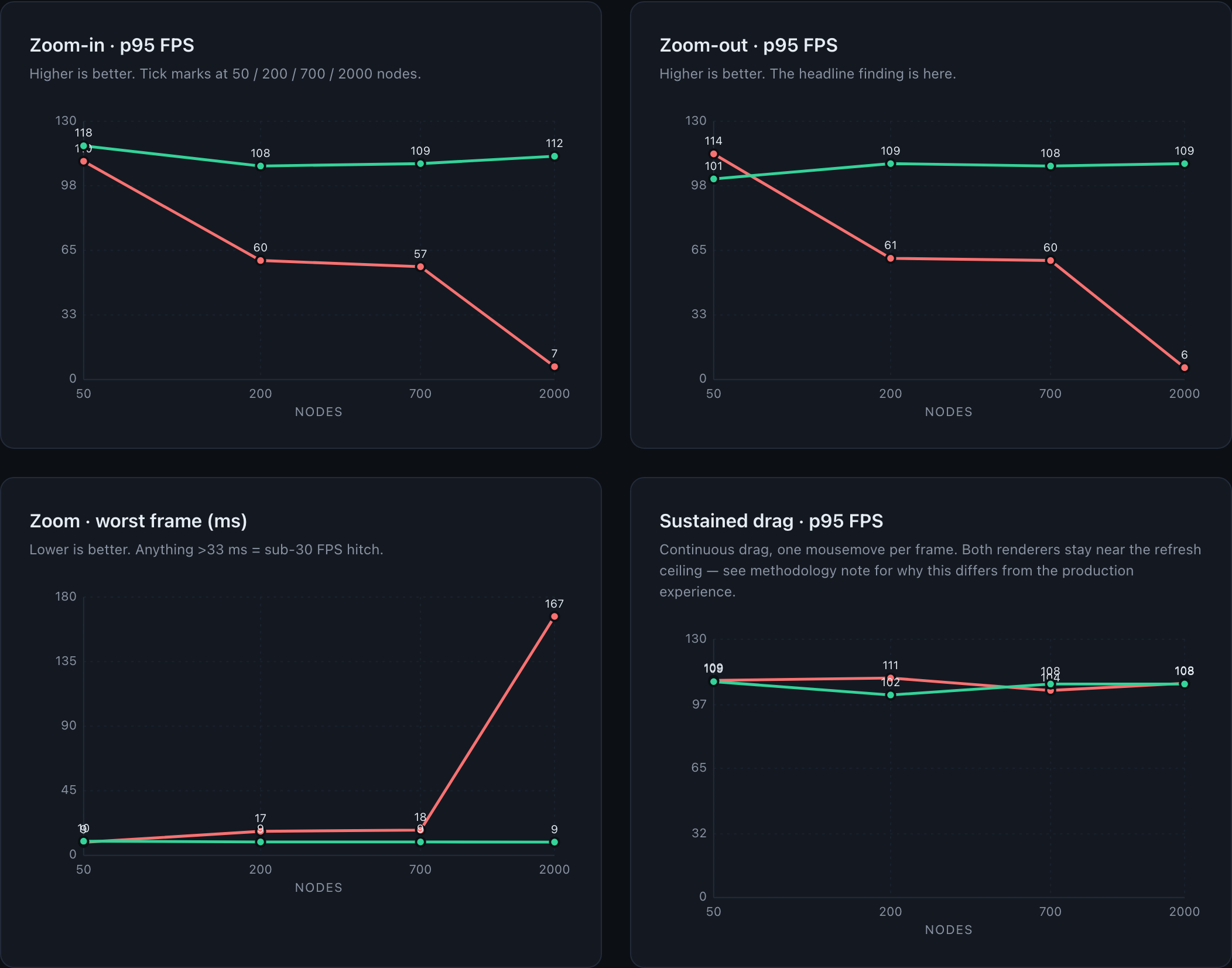
Our frontend ran on React Flow. At a few hundred nodes you don’t notice its overhead, but it’s HTML-based — every node was a small DOM tree of icon, label, status badge. Our enterprise customers operate in the 2,000 to 5,000 node range; at the top, tabs were crashing. Asking a browser to lay out and paint tens of thousands of DOM elements on every pan has a fixed ceiling, and we could see customer scale walking us into it.
The data layer needed more thought. We’d projected graph data into MongoDB documents shaped per view, which kept reads fast when query patterns were simpler and the graph was smaller. As we added new views, the projection layer started doing more interpretive work than it should have, and different views could answer the same question slightly differently. We decided to address this at the root.

The rebuild, in three decisions
We rebuilt the system around three decisions. None of them were obvious going in. They were entangled in practice; the order below is the one that’s easiest to read, not the one we worked in.
1. The rendering substrate
Decision: Keep DOM-based rendering, or look at radically different options?
What was hard. The case for staying on React Flow was real: broad ecosystem support, engineers productive in it, incremental optimizations buying us time. The case against was that we kept hitting a ceiling that was a property of the rendering platform, not of our code on top of it.
Optimization above the substrate can’t fix the substrate. Every move we’d already made (splitting APIs, swapping layout engines, refining render paths) was happening above the renderer. The bottleneck was one layer below us, in how the browser itself lays out and paints DOM.
When you adopt a new foundation, take ownership of it. We forked Reagraph (now Next Graph internally) after a Sigma.js prototype showed how much shader code we’d be writing without a Three.js abstraction; Cytoscape.js’s GPU support and styling model were too thin. We stripped the 3D features we’d never ship and wrote our own edge shader — every edge carries a per-vertex aScale, so hover and select fatten lines on the GPU without any geometry rebuild.
The single decision that paid for the entire migration: draw-call count is independent of graph size. Edges merge into ~2 buffers partitioned by render state; instanceable nodes share one InstancedMesh. Five thousand nodes hit the GPU as the same handful of calls as five hundred — the difference between a renderer that hitches as you pan and one that holds refresh rate.
2. The data layer
Decision: Keep the MongoDB projection layer, or serve graphs directly from a graph DB?
What was hard. The Mongo projection had been how we got query performance acceptable. Tearing it out meant re-validating that Neo4j could serve every read path directly, fast enough.
The graph should be the source of truth, not a derivative. The path used to be Neo4j → transformer → per-view MongoDB documents → API, with each view consuming a different document shape. The transformer made interpretive choices on the way out, and as traversal complexity grew, the projection layer required interpretive choices that didn't always align across views — the right fix wasn't a smarter transformer, it was removing the layer entirely.
Different views shouldn’t mean different read paths. Sink-rooted and Neighborhood weren’t different data — they were different queries over the same graph. The multi-path setup worked when each view had its own clean question; once group nodes crossed view boundaries, supporting them required fetching multiple documents and stitching across paths. Folding both into a single core lineage layer turned consistency from something we maintained into something we couldn’t violate.
The original tradeoff inverted. Mongo was cheaper when we built it — running Neo4j 24/7 was expensive, and pulling a whole pipeline was fast out of a document shaped for that read path. As traversal work grew — subgraphs, group nodes (a Databricks task that contains its own DAG), deeper lineage questions — the gap closed. Cypher and APOC do that work natively; Mongo required us to predict every read path.
It gave us pagination by graph depth for free. The explorer opens at a default depth; users expand leaves or push global depth out a level at a time. The read is one Cypher per request — apoc.path.expandConfig does a depth-capped BFS upstream and another downstream.

3. The layout algorithm
Decision: Keep evolving a general-purpose layout engine, or write one shaped to lineage?
What was hard. We’d been through this once — D3 hierarchy, then ELK.js for subgraphs and group nodes. Each migration bought us a feature; neither solved the cost. On large graphs, the previous engine's global recomputation approach created significant performance constraints.
Domain shape beats general purpose. Lineage isn’t an arbitrary graph. It flows. Depth is meaningful, direction is meaningful, and most of the interesting structure lines up along an axis. We built a grid: columns are depth, rows are nodes within a depth. Most of what a general-purpose engine spends its time deciding, we decided at the schema level.
Incremental beats global. A user expanding a leaf doesn’t need the whole graph re-laid out — they need the new nodes placed and the surrounding region adjusted. Recomputing the world on every interaction was where ELK’s seconds went. Incremental layout dropped the typical update from “go get coffee” to imperceptible.
Constrain the geometry, get readability for free. Edge crossings are what turn a graph into spaghetti. Inside a fixed grid, we can rearrange the rows of a column to minimize crossings against its neighbors when a user expands or collapses, without touching the rest of the graph.
What’s still hard. Cycles, group nodes with their own subgraphs, and dense crossings sit awkwardly inside a depth-keyed grid — the geometry that buys us the common case works against them.
What changed for customers
Graphs that used to crash a tab now hold thousands of nodes at high frame rate. Layout updates are imperceptible. Customers used to filter just to load the page; now it opens at depth five and expands on demand. Neighborhood and the legacy sink-rooted view agree — same query, same graph.
Rollout
We shipped this in two phases. Phase 1 flipped the new engine on for the Catalog and Incidents pages. Phase 2 ports the legacy pipelines view onto the same frontend while keeping the old data path — a strangler-fig step on the way to retiring the “pipeline” concept and standardizing on Neighborhood view.
None of this is done; the layout still has cases that fight the grid, and the renderer’s label textures need an atlas pass.
If the bottleneck is a property of the platform you’re rendering on, no amount of optimization on top of it gets you out. The GPU was always going to be the answer so the only question was when.
If this sounds like your kind of thing, we’re hiring.
Keep Reading
.png)
June 5, 2026
Snowflake Summit 26 Recap: The Agentic Enterprise and the Cross-Platform Gap It Leaves OpenOur team was onsite at Snowflake Summit 2026 and here's what stuck and where we think the story isn't finished yet.
Read More.png)
May 8, 2026
The Silent Killer of Enterprise AI: Why Your Agents Need a "Data Pulse"AI agents trust whatever data they're handed and fail confidently when it's wrong. Pantomath gives them an upstream data health check before they act.
Read More.png)
April 2, 2026
The Rise of the Data Reliability Engineer (DRE) and the Future of Data OperationsThe DRE is becoming essential as data systems grow more complex. Learn how this role helps teams reduce incidents, speed up root cause analysis, and keep data on time and accurate.
Read More